
UI Case Study
Designing a Banking App.
The objective was to create a concept of a new banking experience that is visually appealing and rethinks familiar patterns of banking interaction without losing the wide variety of banking functions and products. At the same time, all functions will be available quickly and with just a few fingertips. Instead of typical and boring, the design should be simple, appealing and fun.
Steps of work

Sketch
In the second phase, I moved on
to low-, mid-and high fidelity wireframes for both - iOS and Android devices. Also, I tested my first designs to users.
Research
The first phase was based on
user research and user flows based
on user stories.
iOS
With my user test results in hand and after some corrections, I moved on to the final UI-design, starting with the iOS application, referring to the
iOS guidelines.
Android
After another round of user testing, I started the last stage and translated my design to the Android version of the application, using the
Android guidelines as
reference.
In the beginning, I conducted research and compared other banking apps in the market. Afterward, I designed 5 user stories - and flows.
From them, I formed one user flow diagram for
some of the Apps main features.
01
“As a frequent user who
is oftentimes short on time, I want an App that is providing me with fast login options so that I have security and save time”
02
“As somebody who
likes it structured, I want all frequently used functions on fingertips so that I have control
and safe time”
03
“As a user who wants transparency in banking, I want to see all my transactions in one place, so that I have control over my expenses.”
04
“As a user who uses apps to simplify banking, I want an fast and safe option to transfer money from my credit cards, so that I save time and
feel secure.”
05
“As a user who doesn't like lists, I want graphical analytics of my finances, so that I better understand what's going on.”

Based on the user stories and the user flow diagram high fidelity wireframes were prepared and integrated into a clickable InVision prototype. After initial testing, they gave me a detailed plan to guide me through the later design process.
High fidelity wireframes

After initial tests with users, it turned out that Face ID was not the desired login process for them. The majority preferred the familiar two-factor authentication with username and password. Touch ID was a popular alternative. So I changed my choice and made these two methods available in my final design before I moved on to the Android Version of my design.
Main Differences iOS VS Android


Forms
iOS - rounded shapes
Android- less rounded shapes
with shadows
Navigation:
Apple - Navigation bar
Android - Hamburger menu
and Android is using a floating button
Apple - „Back“ Arrow
Android - back through the
navigation bar
iOS
Android


Navigation:
iOS - Navigation bar at the bottom
Andoid - Hamburger menu
Fonts:
iOS: San Francisco
Android: Roboto
Different Icon styles
User Interface Design
The main characters to whom I was creating the banking app could be described as people who keep up with the current trends and consider traditional banking apps to be complicated and tedious. And enthusiasts of good-looking, authentic solutions and modern features. To create a banking app my design needed to be clean, cutting-edge and visually appealing.

The main goal of the final design was that the user experience in the application is developed so that any person will be able to use it intuitively. The interface is clean, and modern, in a minimalist style, which makes the application as pleasant as possible.
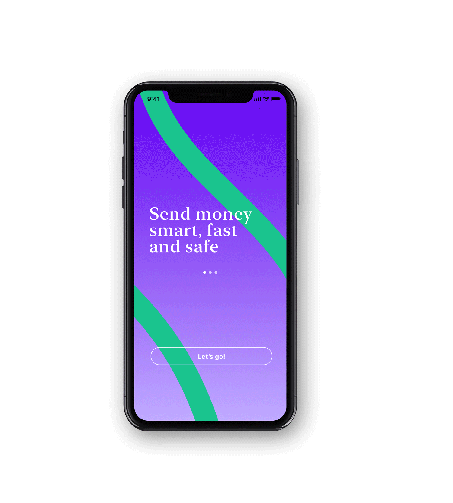
iOS Application

I typically start with designing the iOS application and referring to the Human Interface Guidelines. Afterward, I translate the design for the Material Design Guidelines and Android.

Android Application


