UX/UI Case Study
Designing an E-Commerce App.
Esthetique is a young fashion label where people with disabilities are designers! Every garment and every pattern is made with love and by hand. The people behind the brand really stand for what they do and live the company values Diversity, Respect, Beauty, and Quality every day.
The primary goal of the new branding and Shop was to visually bring these values to life and to let inclusion happen by creating something arresting, beautiful, fun, and very self-confident. Away from the dusty image of a workshop for the disabled, towards a company that can keep up with others in the industry.
In the beginning, I conducted research and compared similar shops in the market. I found interesting patterns and features. With the results and the client-briefing in hand, I worked with
3 user stories.
01
As a customer, I want to be able to place multiple items in a shopping cart, so that
I can purchase more than one item at a time.
02
As a returning customer, I want to be able to save items that I cannot buy to a wish list so that I can purchase them at a later date.
03
As a customer, I want there to be a variety of payment options,
so that I can choose the payment method that suits me best.
User Flow Diagram
From the stories, I formed a user flow diagram for some of the Apps main features.

Wireframing
I decided on one user flow (03) and started with
low fidelity wireframe sketches before designing
mid-fidelity and high-fidelity-interfaces.

Mid Fidelity Wireframes

High Fidelity Wireframes
With this step, I slowly approached a final design. Even though it wasn't quite perfect yet, it was a good time to test it on users for the first time to eliminate possible errors.


Testing
To validate my decisions I created a simple prototype using InVision based on the scenario from user story 03. I recorded and analyzed their feedback, to incorporate relevant changes into my designs.
The users were asked to:
Browse the shop for a woman's tank top, put it
in the shopping cart, and to buy it using the
payment option Klarna.
Link to prototype:

Feedback
Even though no serious errors were found, I took their feedback into account in my final design. Instead of "Sign in" I used "Create account" to make the difference clear for everyone.
Final Screen Design
Based on the wireframes I started designing the product’s final user interface.
My responsibility was to give the overall look as
much personality as the individuals who work there with so much love and fun. My goal for the application was an intuitive, accessible, and user-friendly UI design with the right blend of minimalism and character. Therefore the design had to be
Simple, Bold, and Expressive
Because the company is based in the Ruhrgebiet I wanted to play with the cole-background and use black, and in contrast a lot of colors.


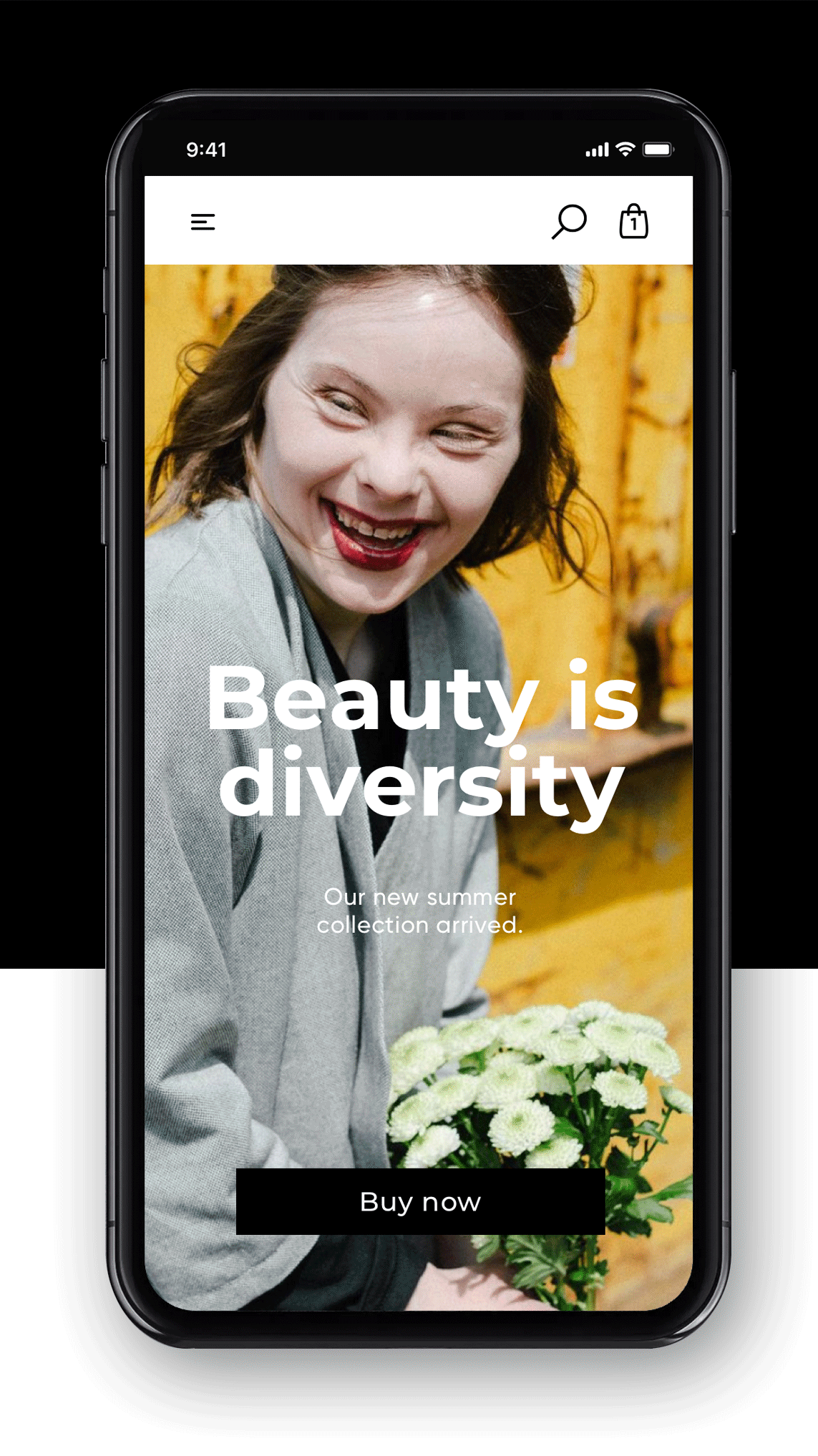
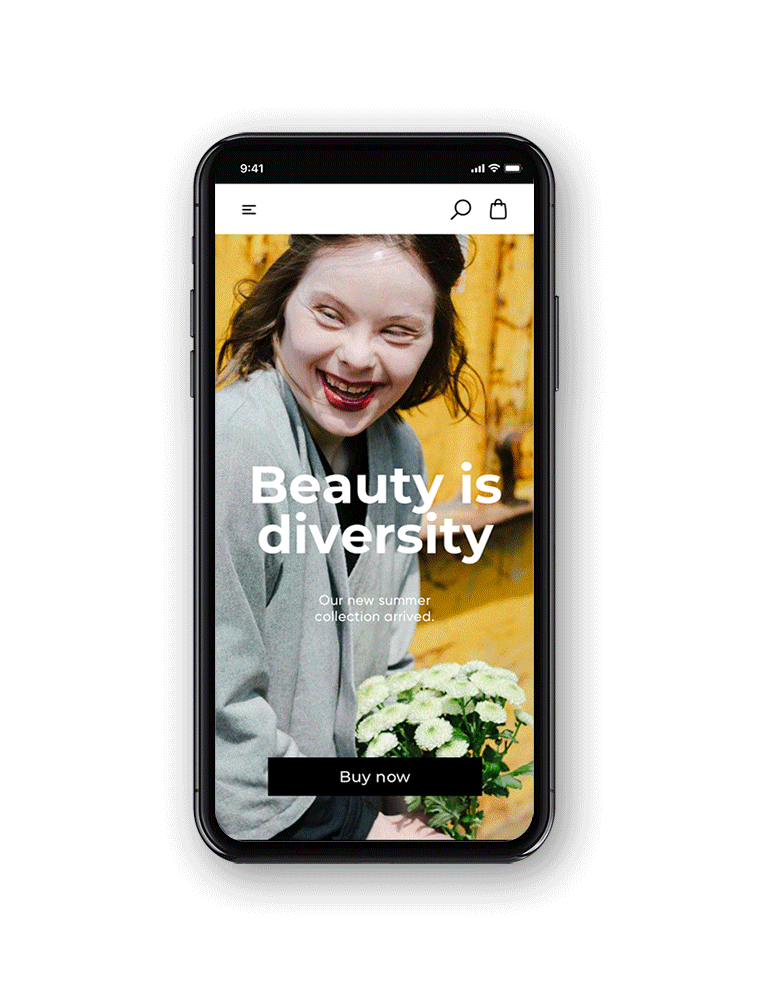

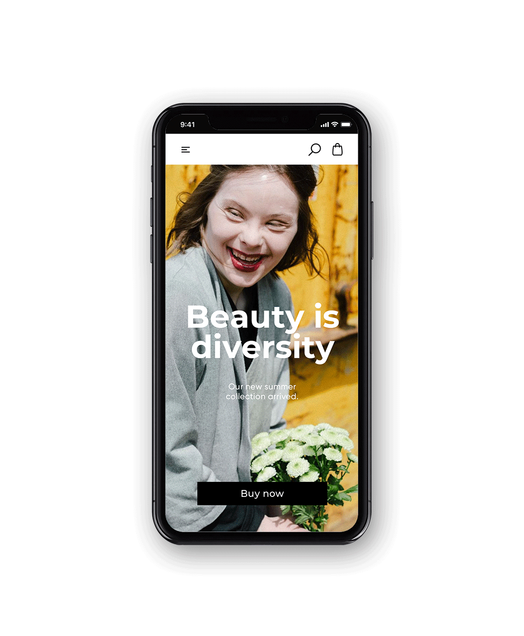
Home Screen
A colorful welcome and a lot of inspiration without being overwhelming.
The menu to the top, analogous to the other media. The navigation was reduced to the essentials, with a focus on search and the shopping basket. Everything else, as well as the favorites, is located on the main menu.

Search
The search screen has been kept as clean as possible. Here the user can find everything at a glance - he can enter
a search term or use the categories.

Add to cart
The operation is intuitive and pleasant, illustrations show the users what is happening and are a small fun fact.
Main Menu
Only available from the Home-screen.
I decided on this version as it's never more than 3 times clicking away and the general structure is clearer, cleaner,
and reduced to the essentials.
Product View
All product-relevant pages are clean and reduced. The product is the hero, nothing distracts. The most important information is visible without scrolling.
Shopping Cart
The cart shows all relevant information. At the end of the screen, users already have the option of choosing whether to "log in" or to "create account" - this saves an extra page.


Payment
As a returning user, all data is already saved. These can be easily changed by clicking one icon. A number of common payment options are available.
Lorem ipsum
As a returning customer, I want to be able to save items that I cannot buy to a wish list,
so that I can purchase them at a later date.


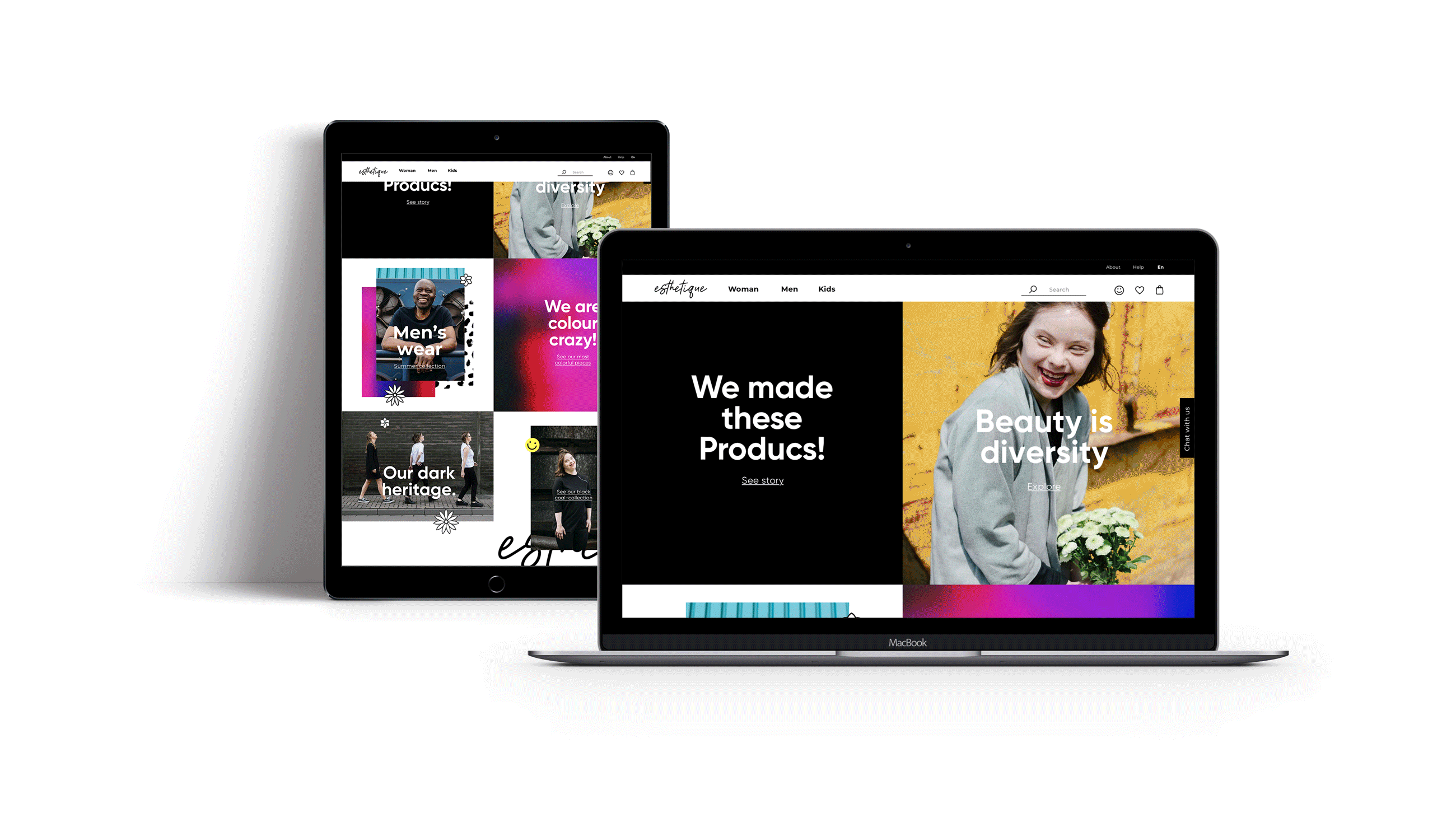
Responsive Design
Finally, I designed a responsive design that aims to display optimally across different screen sizes. It's a slightly different layout for the content on a desktop computer or tablet but mainly everything remained the same.